This past weekend we finally got the sagging joist fixed! I am so excited and still in shock. It seemed like the project wasn't going anywhere, it had stalled out. Then all of the sudden the joiste was fixed and concrete board down in the kitchen. And now I need to decide what tile I want! That is the hard part.....
I originally wanted to paint my wood floors. But it just wasn't going to work out. The floor boards were in terrible shape and once I really really thought about it, I decided we do too many projects in our kitchen. I have visions of having to re-paint the floor every year! So I am contenting myself with painting the porch floor, the basement steps and the kick plates of the main staircase.
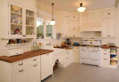
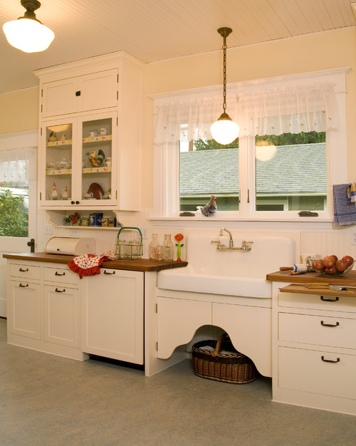
The picture above is what I am envisioning the kitchen to look like. Envisioning is the key word here. I know it really isn't going to turn out to close to it. But this is the look and feel I want.
I am going to go with a lighter color counter top, the cabinets are going to be white and the walls will probably be a light blue.
I am going to go with a lighter color counter top, the cabinets are going to be white and the walls will probably be a light blue.
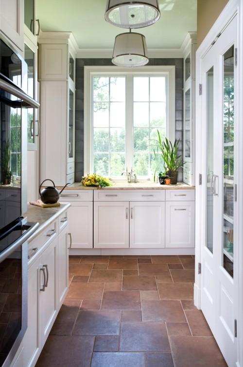
Should I go darker tiles, like these? To give the kitchen a bit of warmth.
I like the almost flagstone look here.
Or........
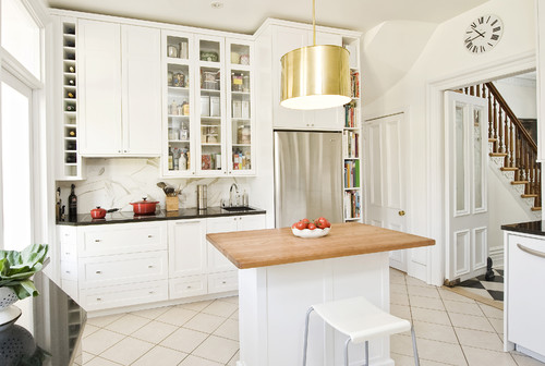
White or light colored tile?
 |
| Traditional Kitchen design by Seattle Kitchen And Bath Sadro Design Studio Inc. |
What would go with? Light and bright and clean? Or more of a cozy farmhouse look?
P.S. All the fabulous pictures are from Houzz. A wonderful site filled with pictures of houses!


Oh my, I just love these pictures. Would love to have a kitchen like the one on top. I wouldn't have the floor too light, it shows dirt to easily. :o)
ReplyDeleteVery true! I will keep that in mind. Thanks for your comment!
DeleteBeautiful inspiration photos! I love your ideas. The chicken decor in the first photo was so cute.
ReplyDeleteHouzz.com is filled with so many lovely pictures, it is hard to decide which look I want!
DeleteI like both floors! I'm a big help, huh? Beautiful inspiration photos. I wanna see yours! lol Hope you'll do before and after!
ReplyDeleteI've got some catching up to do here--I've missed several posts while I was gone!
Have a great weekend!
Dru
Thanks Dru! Writing about it helped clarifiy my thoughts too. I will work on getting some before and after pictures up soon, now that I have an "after".
DeleteDear Heide,
ReplyDeleteIn my opinion you have the right ideas in mind as to what you want plus, you have great taste in kitchen décor. I was smitten over the first photo, I want that kitchen… Now, if you asked me what I liked as far as kitchen décor, I would definitely go with the farmhouse, simply because it is what I like the most. For instance, the first picture of the kitchen you posted by Traditional Kitchen design by Seattle Kitchen And Bath Sadro Design Studio Inc. offers great inspiration to create a kitchen which is light in color and inviting as well. Still, the floor color seems to be a bit light on this particular photo, but if you are trying to achieve a similar look incorporating a darker color on the floor while keeping the walls and cabinets light; the dark floor will not take from the openness the bright colors on the walls and cabinets bring into the kitchen. Furthermore, whichever colors you decided to incorporate into your kitchen walls, cabinets, and floor I am most certain you are going to make it look cozy and inviting. Great Post!
Thanks Jacqueline! That first picture is one of my favorites. Even if I went with a light color, it wouldn't be as light as the floor in the picture.
DeleteI've been very pleased with the tile we put in 6 years ago. Though I like the look of the dark tile above, I knew it was just too dark. And as another commenter said, light tile really shows the dirt. We chose a not too light not too dark stone-look, so variegated shades, which really hide the dirt!
ReplyDeleteWe have tile throughout the entire house, all 3 levels. It's all a very light beige-y color. (I did not pick out as my husband was in the process of building the house when we met.) The grout matched the tile then, and now the grout is very dark. The tiles show everything. If I could do it all over, we'd have a darker tile and grout.
ReplyDelete